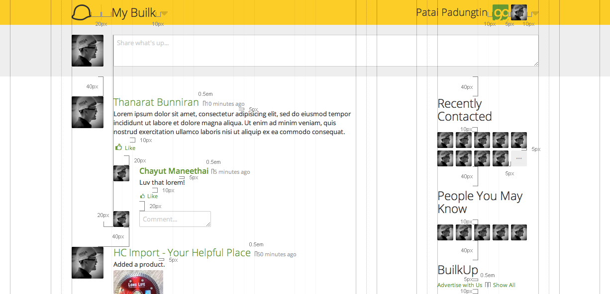
In providing a clean and minimal interface, excess design artifacts must be removed. Instead of using separator lines, which is actually composed of 3 elements - the leading space, the line itself, and the following space - a simple space which is a single element should suffice. However, similar to using different line weights, white space must correctly reflect the information architecture. This can be achieved by maintaining a consistent space between siblings, and larger spaces between higher level sections. It is crucial this spacing remain constant within pages and across the site. Similar to keeping objects aligned to a consistent grid, slight changes in spacing of objects on the same level may imply wrong information separation.
When leveraging white space, it is best to be generous with screen real estate and use a decent amount of spacing. Since pixels come free and the average user no long minds scrolling, doing so ensures a clear information architecture and scannable document. Apart from spacing between elements, alignment is also crucial and much noticeable in designs which employ a lot of white space, so ensuring sections align to the grid is a necessity in maintaining a professional touch.