 Style Guide
The Builk design is based on a fluid grid comprising of 10 equal columns with 40 pixel gutters. Under normal use, the far most columns will not used, giving Builk plenty of breathing space.
In a single column layout, the page will span the full width which are the 8 center columns.
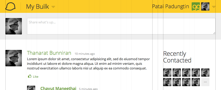
When adding a side bar, the main column is reduced to 5 columns, and the side bar 2. A column is left in between for extra breathing space.

When viewed on typical (1388x768) wide screens or larger, the full grid is in place.
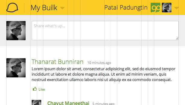
However, when viewed on smaller screens, such as 1024x768, the padding columns are removed and only the gutters are used for padding.
On mobile screens, the sidebar is then moved to the bottom to accomodate more width.